
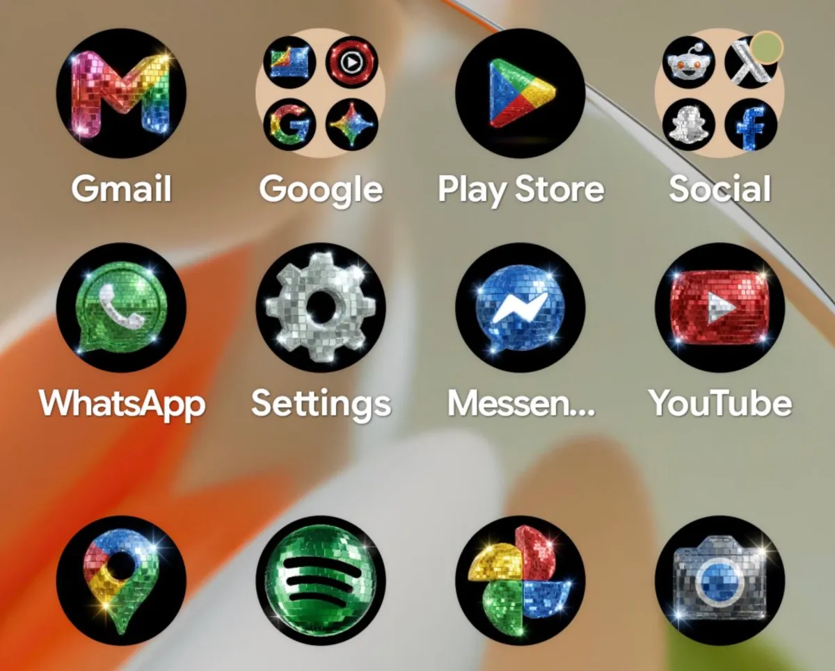
The Rise of Aesthetic Playfulness in Mobile OS Design
Google has officially introduced a disco-themed icon pack for Android users, leaning into a trend that recently sparked significant online polarization when Spotify experimented with a similar look for its 20th-anniversary celebration. By allowing Pixel users to overhaul their home screens with high-gloss, disco-ball-inspired aesthetic templates, Google is signaling a departure from the strict, monochromatic corporate branding that has defined mobile interfaces for the past decade.
This rollout, announced by Android ecosystem head Sameer Samat on X, leverages the custom icon functionality introduced in the March Pixel Drop. What began as a tongue-in-cheek social media engagement exercise—initially polling users on the viability of disco-themed branding—has materialized into a functional update, marking a rare instance where manufacturer-level software engineering quickly pivots to mirror fleeting internet memes.
Strategic Shift: From Utility to Personal Expression
For years, Android attempted to curate a cohesive, Material You design language, where system icons would strictly adhere to wallpaper color palettes to ensure visual harmony. The introduction of specific styles like Scribbles, Treasure, and Easel indicates that Google is pivoting toward granular, user-driven customization rather than enforcing a rigid design aesthetic.
This shift suggests that tech giants recognize the limitations of static UI design. Younger demographics, particularly Gen Z and Zillennials, are increasingly favoring whimsy as a psychological counterweight to macroeconomic instability. By offering these kitschy, highly decorative design layers, Google is effectively providing a digital sandbox that encourages playfulness—a stark contrast to the sterile, productivity-first home screens of the early smartphone era.
The So Bad It’s Good Design Paradox
The commercial reception of this disco icon pack highlights an interesting paradox in contemporary software design: users are increasingly eager to embrace ugly or intentional kitsch if it offers a sense of personality. While industry traditionalists might view these sparkly icons as an affront to user experience (UX) principles and interface legibility, the overwhelming engagement on social media proves that functional utility is no longer the sole priority for smartphone owners.
By allowing users to turn their home screen into a disco, Google is not just updating software; they are participating in the lifecycle of internet culture. The company is effectively gamifying the Android experience, turning what was once a utility-driven home screen into a canvas for performative self-expression.
Industry Implications for UI Customization
The success—and controversy—surrounding these icons suggests that the era of the uniform operating system is fading. As smartphone hardware reaches a plateau in innovation, software developers are turning to aesthetic flexibility to maintain user interest. We should expect to see more platforms implement limited edition aesthetic drops powered by generative themes.
For industry observers, this development serves as a case study in responsive product management. By merging AI-generated design assets with rapid deployment cycles via Pixel Drops, Google is demonstrating a new capability: the ability to integrate ephemeral pop-culture trends directly into the core operating system without compromising the underlying codebase. Ultimately, whether these icons are a stroke of design genius or a brief, glittering eyesore, they set a precedent for a future where mobile interfaces are as fluid and temporary as the social platforms they host.